Halving the time to complete inspections on web
Poor navigation and a page-per-level structure made the core Visibuild web experience deeply inefficient. Users were reverting to mobile just to get work done. I redesigned the inspection flow, and halved completion time. I was both the designer and the product manager on it, and we shipped it in a single four-week sprint.
50%
reduction in inspection completion time
66%
fewer clicks to complete a typical inspection, from ~15 to 5
4 weeks
from kickoff to shipped, in one sprint
Problem
Web took 3–4× longer than mobile, so users were reverting to their phones to get work done.
The existing experience treated every level of a nested inspection as a separate page. Users constantly lost context. Jumping between related tasks meant navigating back through multiple pages, and completing any single requirement meant opening a modal on top of it all.
- Every nested task opened a new page, destroying context
- Jumping between sibling tasks required 5+ back clicks
- Every requirement opened a modal, so multiple tasks couldn't be seen at once
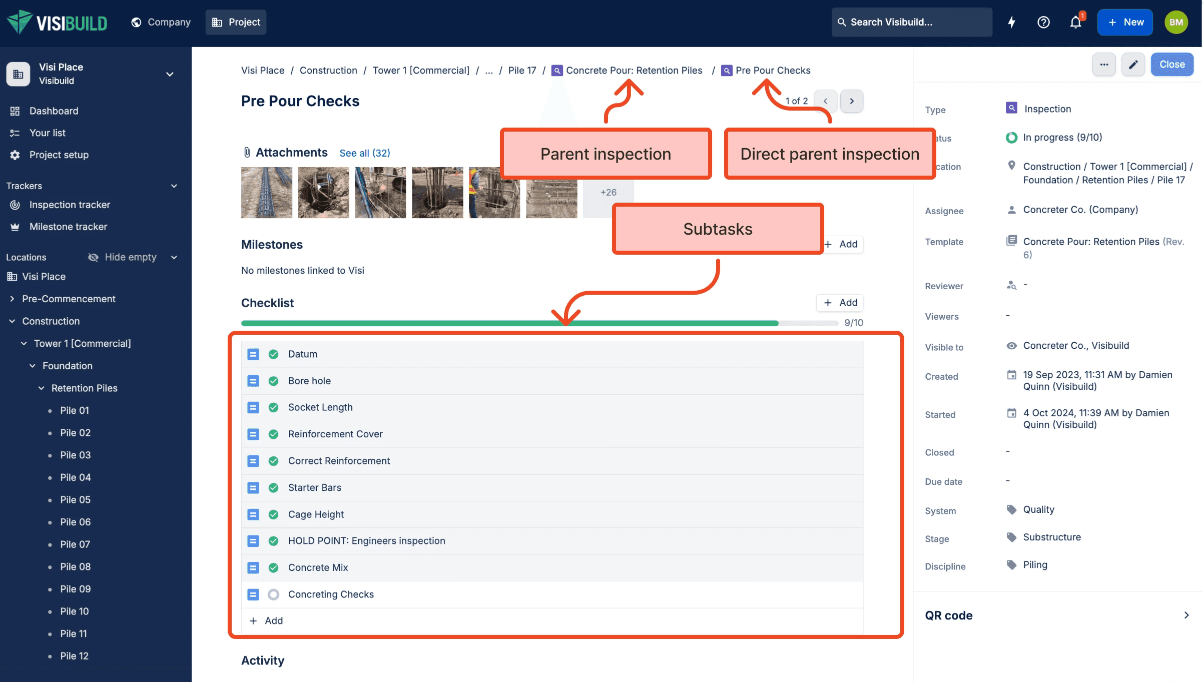
The old page. The parent, the direct parent and every subtask were separate pages, so moving between related tasks meant leaving the one you were on.
Visibuild's core purpose is to increase efficiency on site. Our web experience was doing the opposite.
Context
A single inspection can span 10+ nested levels, and the old UI treated each one as a separate page.
Inspections in Visibuild, called Visis, represent work that must be complete before a project can proceed. You can't pour concrete until the pre-pour inspection is done, signed off, and documented. A Visi can be a simple checklist item or a complex, multi-level inspection with deeply nested subtasks.
Concrete Pour: Suspended Slab
  └─ Pre Pour Checks
      ├─ Concrete Design
      │   ├─ Review structural drawings
      │   ├─ Verify concrete grade specifications
      │   └─ Check reinforcement schedule
      ├─ Mud Map
      │   ├─ Confirm slab boundaries
      │   └─ Verify penetration locations
      ├─ Formwork Pre Pour
      │   ├─ Check formwork alignment
      │   ├─ Inspect props and supports
      │   └─ Verify edge forms secured
      └─ Penetrations
          ├─ Sleeves installed correctly
          └─ Waterproofing around penetrations
  └─ Post Pour Checks
      └─ [...]
With 5–10 child inspections under a single parent, comparing two related tasks meant 10+ clicks. Navigation between siblings was nearly impossible.
Research
Users loved mobile's scrollable view, and they wanted the same on web, not another page to click through.
I ran discovery calls with power users across key personas and cross-referenced findings with behavioural data to validate what I was hearing.
"On my phone, I can see everything at once. On web, I'm clicking through pages constantly. Why can't web work like mobile?"
Project Coordinator
Users loved mobile's single scrollable view: scan ahead, see what's coming, complete tasks without losing context. This drove the decision to eliminate modals entirely and make all tasks expandable inline.
"I'll be three levels deep reviewing formwork, then need to check something in concrete design, and I can't figure out how to get back without clicking the back button five times."
Quality Manager
We had made it impossible to understand the relationship between tasks. This drove the decision to introduce a persistent tree navigation panel showing the full hierarchy at all times.
Decisions
Three changes collapsed a 15-click inspection into 5: a modal shell, a hierarchy panel, and inline completion.
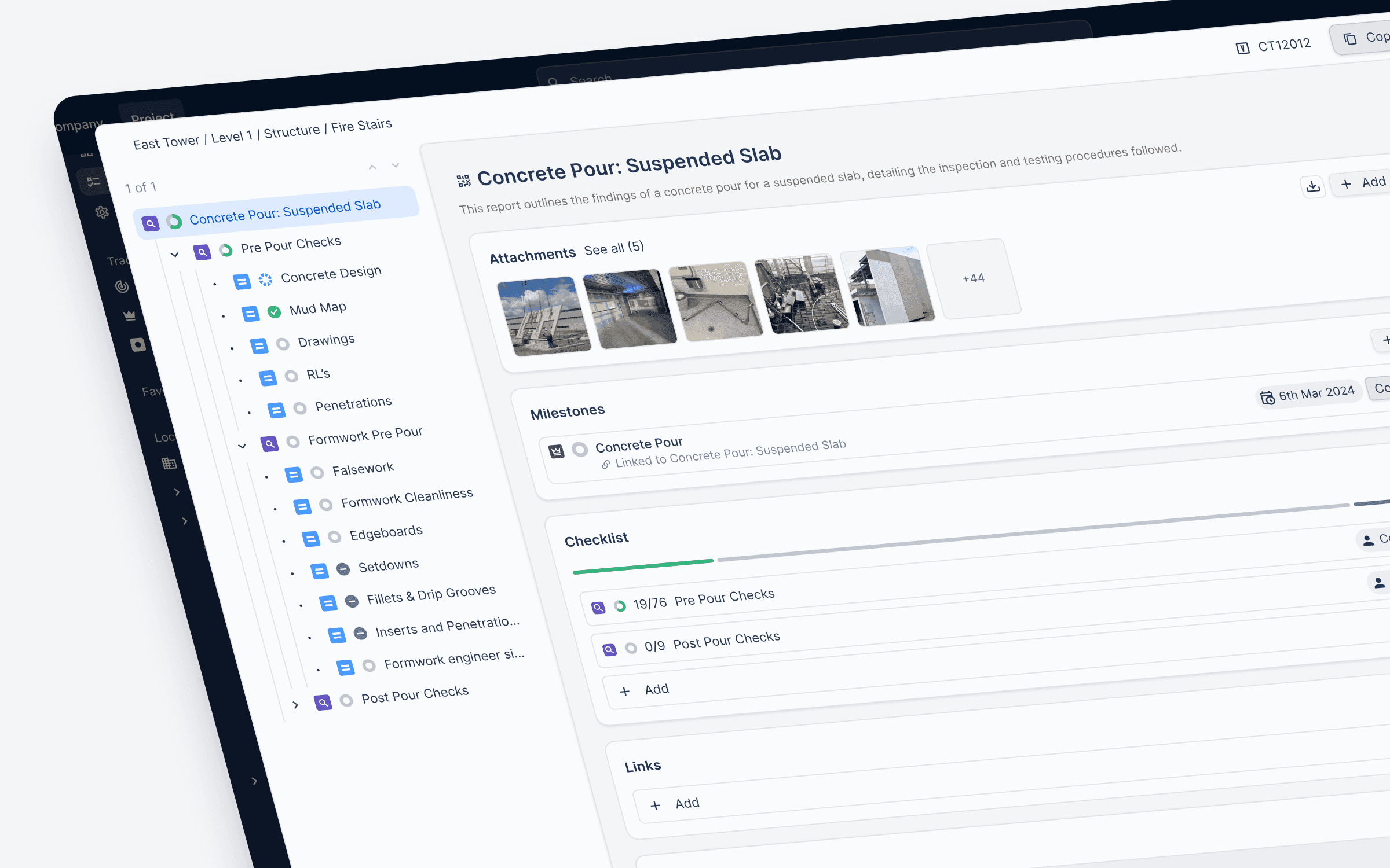
The redesign: a full-page modal, a persistent tree on the left, and the checklist given the centre of the screen.
01 · Full-page modal over separate pages
Users needed to jump quickly between inspections and other areas of the app. The old approach forced reliance on the browser back button and broke context at every step.
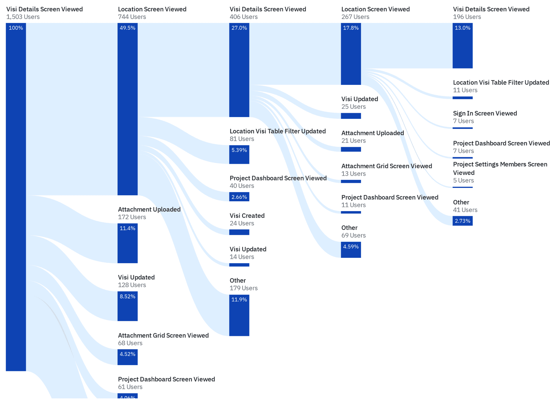
Where users went after opening an inspection. They rarely stayed: most branched out to locations, attachments or dashboards, and then came back.
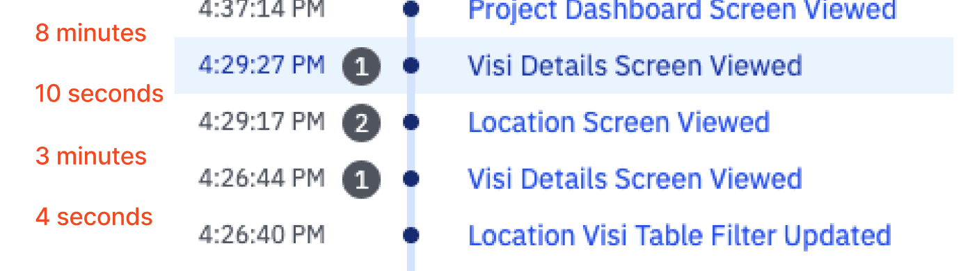
One user's session: out of the inspection to a location, back in, out again. On the old page, each return trip went through the browser back button.
Moving to a full-page modal meant users were never pulled away from where they started, and as Visibuild expands, Visis can be accessed from anywhere in the product without losing context.
02 · Tree navigation panel
Modelled on our existing template builder, a familiar mental model for power users, the tree shows the entire inspection hierarchy at a glance and lets users jump to any task directly. Users went from one page per level to a single view for navigating an entire inspection.
Capital TowersConcrete Pour: Suspended SlabPre Pour Checks
Concrete Design
Attachments
AddChecklist
AddMilestones
AddNo milestones linked to Visi
Links
AddActivity
Interactive: expand the hierarchy and jump straight to any node. Only the left rail responds; the rest of the modal is shown dimmed, tracking the selection.
In the shipped product: moving through a deeply nested inspection from the tree.
03 · Inline task completion
Closing a single task on web took seven steps, two of them a modal opening and closing. Users close a high volume of tasks in one sitting, so every one of those steps was paid again and again.
- 01Open the parent Visi
- 02Open the subtask
- 03Press complete requirements
- 04Open the requirement modal
- 05Fulfil the requirements
- 06Save
- 07Arrow forward or back to the next task
- 01Open the parent Visi
- 02Open the subtask
- 03Fulfil the requirements
- 04Save
Mirroring the mobile experience, all requirements became expandable and completable inline, with no modals. Auto-expansion of the next task pre-empted the user's next step. Clicks for a typical inspection dropped from ~15 to ~5, a 66% reduction.
Checklist
Interactive: open a requirement and close it, or take one of the alternatives behind the split button. Finishing one opens the next automatically, crossing into the following group when a section runs out.
In the shipped product: closing requirements inline, one after another, without leaving the checklist.
Outcome
Completion time halved. Users shifted how they worked, and told us about it unprompted.
I tracked time to complete through in-product analytics, and ran timed usability sessions to check it against the goal. Time to complete inspections halved. Analytics showed users completing inspections from the parent level, so the inline completion flow had genuinely shifted how they worked. Customers proactively contacted the customer success team to praise the new experience.
"It is significantly easier to complete or check over Visis now! Great change."
Customer, via customer success
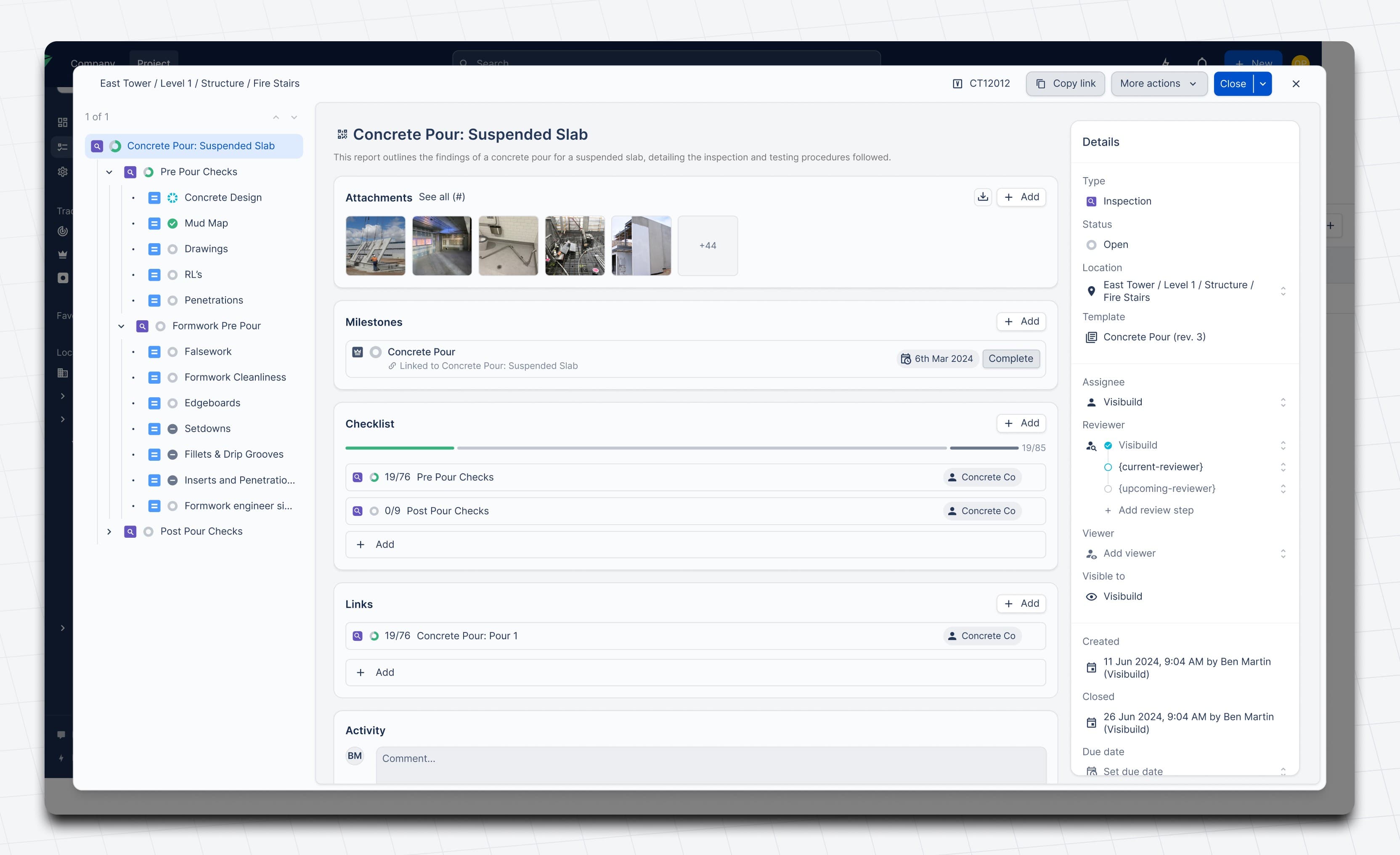
The shipped inspection modal.
The same inspection on the old page and the new one.
A speedrun: completing the same inspection on the old page (top) and the new one (bottom), side by side.
Reflection
Good design isn't enough. You have to bring people with you.
I underestimated the change management required. Construction teams aren't always tech-savvy, and even time-saving changes can feel jarring when they disrupt established workflows. We shipped a meaningfully better experience, but the sudden shift created initial friction that clearer communication could have softened.
Key learning: for core workflow changes, invest as much in explaining why as you do in designing what. In-app education, gradual rollouts, and setting expectations about adjustment periods would have smoothed the transition significantly.