Designing, building, and growing a solo iOS app to 3,500 users
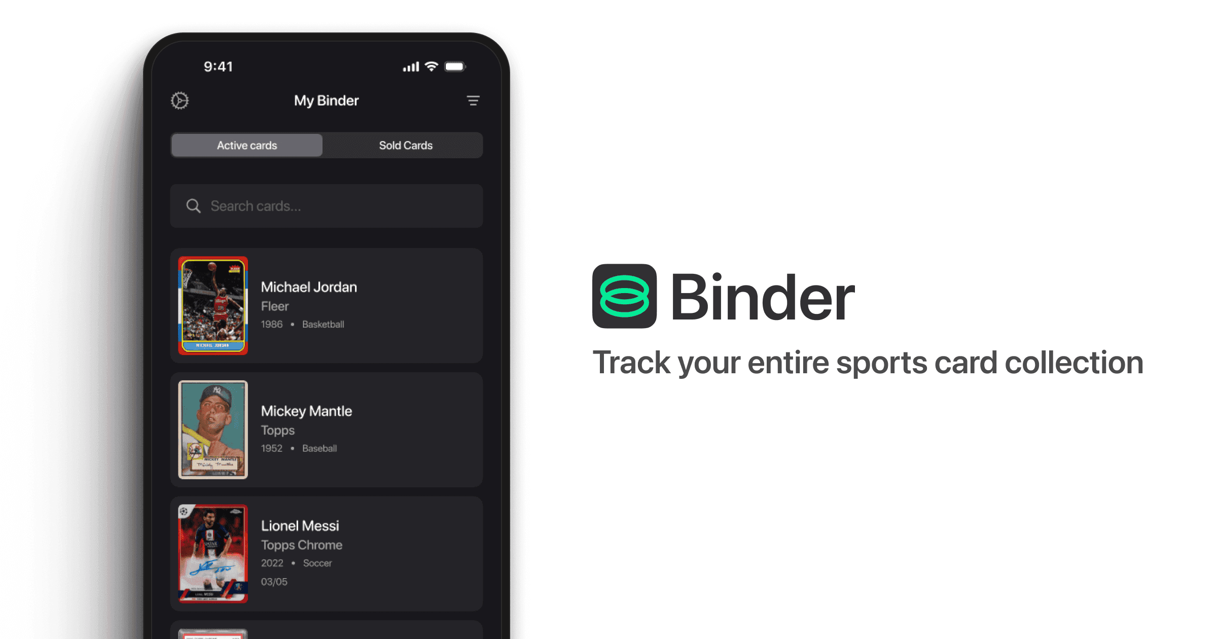
Binder is an iOS app I designed and built solo to solve a problem I faced as a card collector. It has grown to over 3,500 users and $1,500 in monthly recurring revenue, entirely through organic channels and intentional design decisions. This is the story of how thoughtful product design, not marketing spend, powered that growth.
3,500+
users, with zero ad spend
$1,500
monthly recurring revenue
250k
average weekly views across social platforms
2.4%
churn rate vs. 5–9% category average
Problem
Collectors had no good option: spreadsheets were too clunky, marketplaces too complex.
Card collecting is a deeply personal hobby. Collectors want to track what they own, understand its value, and share their finds with a community that gets it. But the tools available forced a choice between two bad options: manual spreadsheets with no visual appeal, or bloated marketplace apps designed for selling, not collecting.
- Spreadsheets required too much manual effort and had no visual payoff
- Marketplace apps were cluttered with selling features irrelevant to casual collectors
- Nothing existed that let users scan, track, and share quickly, without noise
That gap became the opportunity. Collectors needed something fast, intuitive, and built around the joy of the hobby rather than the transaction around it.
Approach
Growth was never an afterthought. It was designed into every feature from the start.
The reason I started Binder was to push my skills beyond craft and into distribution. That meant every design decision carried two questions: does this serve the user, and does this create a reason to share? Three principles shaped every call made along the way.
Zero friction
A user should be able to scan their first card within ten seconds of opening the app. Any step that slowed that down was a candidate for removal.
Visual clarity
Data should feel beautiful, not overwhelming. Collectors are drawn to clean, well-presented information, and the UI needed to match the care they put into their physical collections.
Built-in distribution
Every feature was evaluated with growth in mind. If a feature could create a natural moment for a user to share Binder with someone outside the app, it was prioritised.
Product
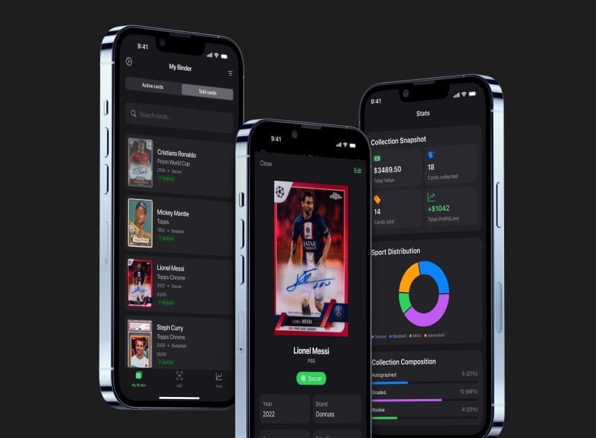
Three design decisions did most of the heavy lifting: onboarding, the share loop, and UI credibility.
Intentional onboarding
Onboarding was one of the areas I chose to over-invest in. It's the user's first impression, and I wanted it to feel personal, like Binder already understood the kind of collector they were. The flow asks about their favourite sports, how long they've been collecting, and what types of cards they focus on. By the time they finish, they've built a small profile that reflects who they are. That sense of input creates a personal connection to the product before a single card is scanned, so users arrive with context, not a blank screen.
- 01Welcome to BinderProduct demo
- 02Enter your namePersonalisation
- 03Choose your sportsPersonalisation
- 04Binder tailors content to your sportProduct demo
- 05How long have you been collecting?Personalisation
- 06How many cards are in your collection?Personalisation
- 07Getting cards into Binder is easyProduct demo
- 08Turn on notificationsApp prompt
- 09Leave a ratingApp prompt
- 10Customising your experiencePersonalisation
- 11PaywallApp prompt
The share loop
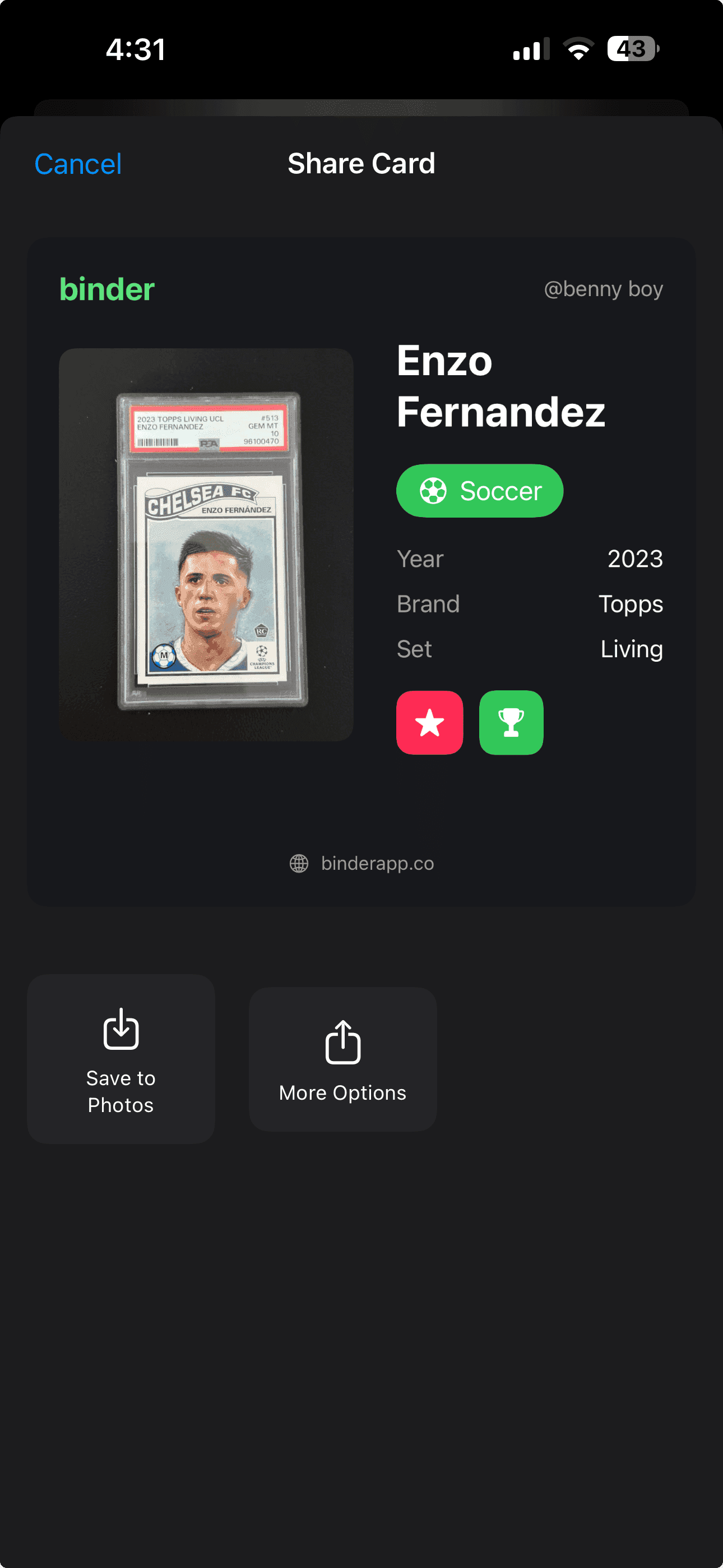
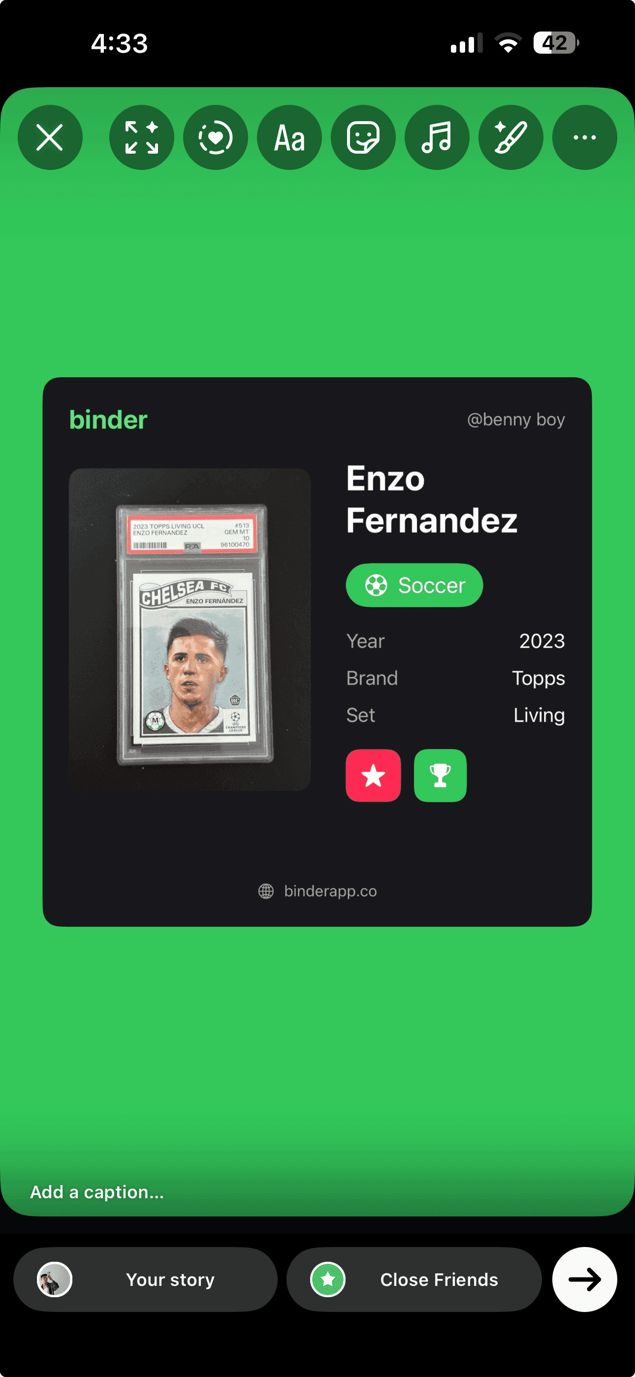
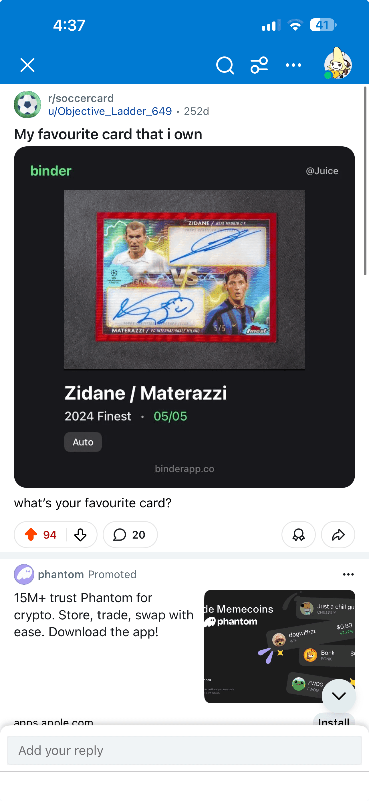
Every scanned card could be instantly turned into a shareable image optimised for TikTok, Instagram, and Discord, complete with player name, year, and set details. This created an organic distribution loop: users shared their collections, followers asked "what app is that?", and new downloads followed. Collectors love to show off their finds. The goal was to make Binder the tool that made that bragging look good.
UI built for credibility
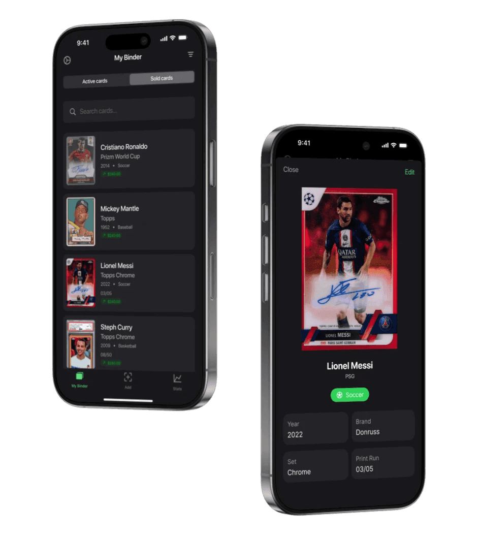
Collectors trust polish. Every visual choice supported shareability: layouts framed cards beautifully, typography made data legible at a glance, and motion feedback made scanning feel premium. By nature, a collector who values the aesthetic of their physical cards will quickly dismiss an app that doesn't match that standard. Clean UI wasn't vanity; it was a trust signal.
Monetisation
Monetisation was treated as a design challenge: the goal was to give so much value that paying felt like a steal.
With low running costs, I could afford to be generous. Binder adopted a free-core, premium-upgrade model that kept free users fully functional while giving power users something genuinely worth paying for.
Free users
Full scanning and collection functionality with no paywalls blocking core use. Free users fuel distribution: every share they make is a lightweight ad for Binder.
Subscribers
Detailed collection analytics, stats tracking, and design upgrades like custom app icons. Every paywall moment was deliberately positive and contextual, triggered at the point where the upgrade felt like a natural next step, not a frustrating block. That timing turned consideration into conversion without hurting retention.
The model aligned incentives cleanly: free users drive growth through sharing, subscribers fund sustainability through upgrades, and both experiences feel generous rather than gated.
Paywall optimisation
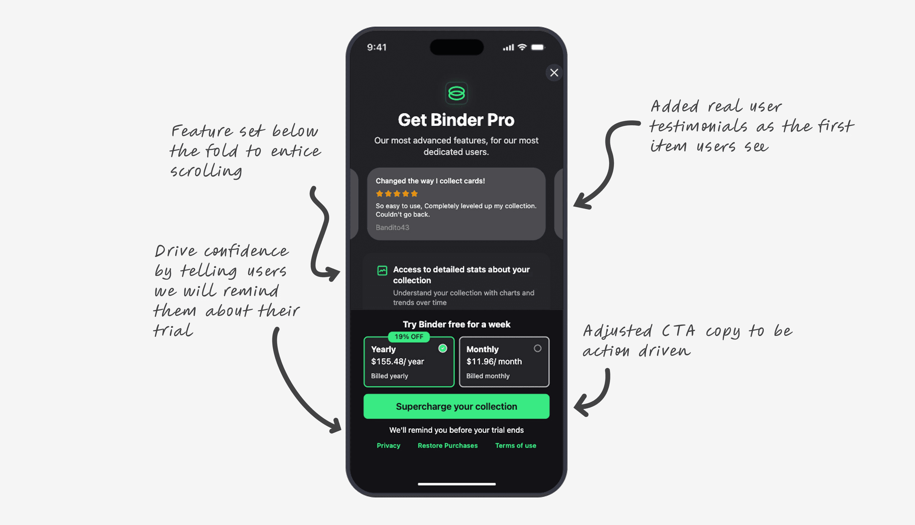
The paywall went through several rounds of changes: real user testimonials became the first thing people see, the feature set moved just below the fold to invite a scroll, the button copy became action-led, and a promise to remind people before their trial ends gave them the confidence to start one.
Growth
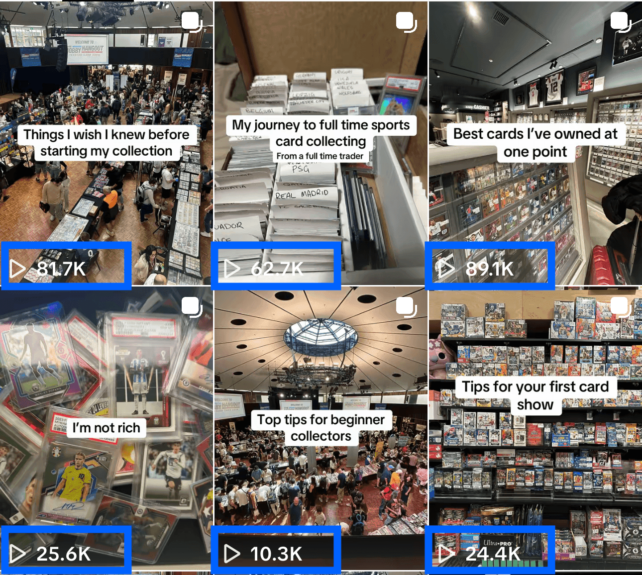
250,000 weekly views across Instagram and TikTok. No paid ads, just content that felt native to the hobby.
Binder's growth came almost entirely from social content. Rather than paid acquisition, the strategy was to build genuine interest through a mix of broad sports content that appealed to collectors generally, and product-focused videos that showed Binder in use. The balance mattered: the brand needed to feel native to the hobby, not like a startup trying to sell an app.
Each viral clip acted as a lightweight product demo, showing the scanning flow, the shareable card output, or the stats page in action, and led directly to downloads. Binder's visual design played a supporting role here too. It photographed well, felt credible on screen, and stood out in a fast-moving feed. The product's shareability wasn't accidental; it was designed in from the start.

App Store analytics from the growth period: impressions up 540%, page conversion at 30.9%, downloads up more than 40×.
Retention
Growth was half the goal. The other half was a reason to come back that didn't rely on streaks.
Binder was designed to be sticky in a natural way. The more cards users added, the more value they built into the platform. Each scan deepened the sense of ownership and made it harder to leave. The collection itself became the reason to stay.
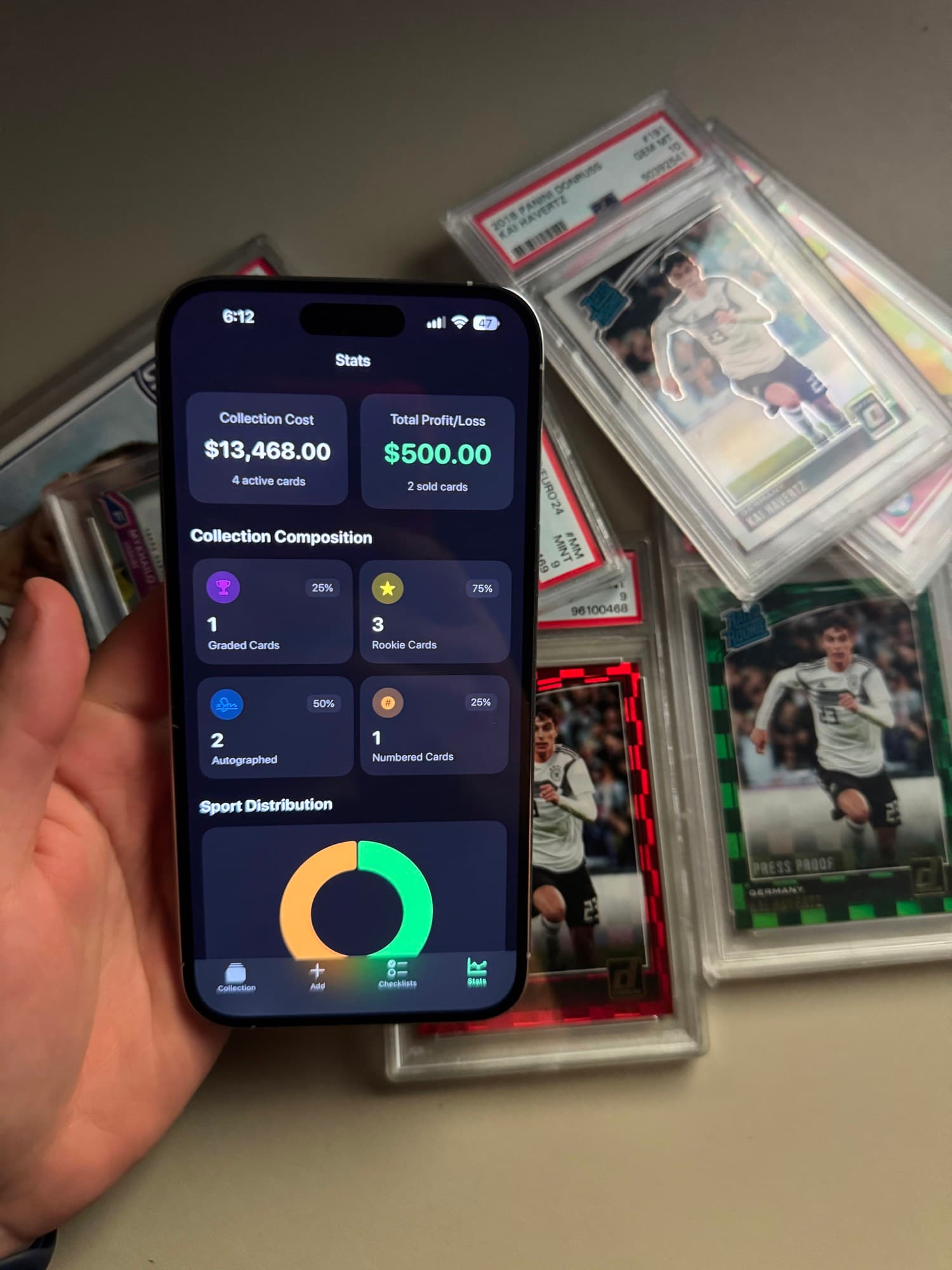
To support that habit, Binder surfaced meaningful updates over time. Weekly notifications highlighted changes to a user's collection: new additions, completed sets, movement in stats. The Stats page amplified that feeling. Watching numbers climb gave users the same hit they'd get from sorting cards in real life, a positive loop between collecting and opening the app.
Content that keeps pace with releases
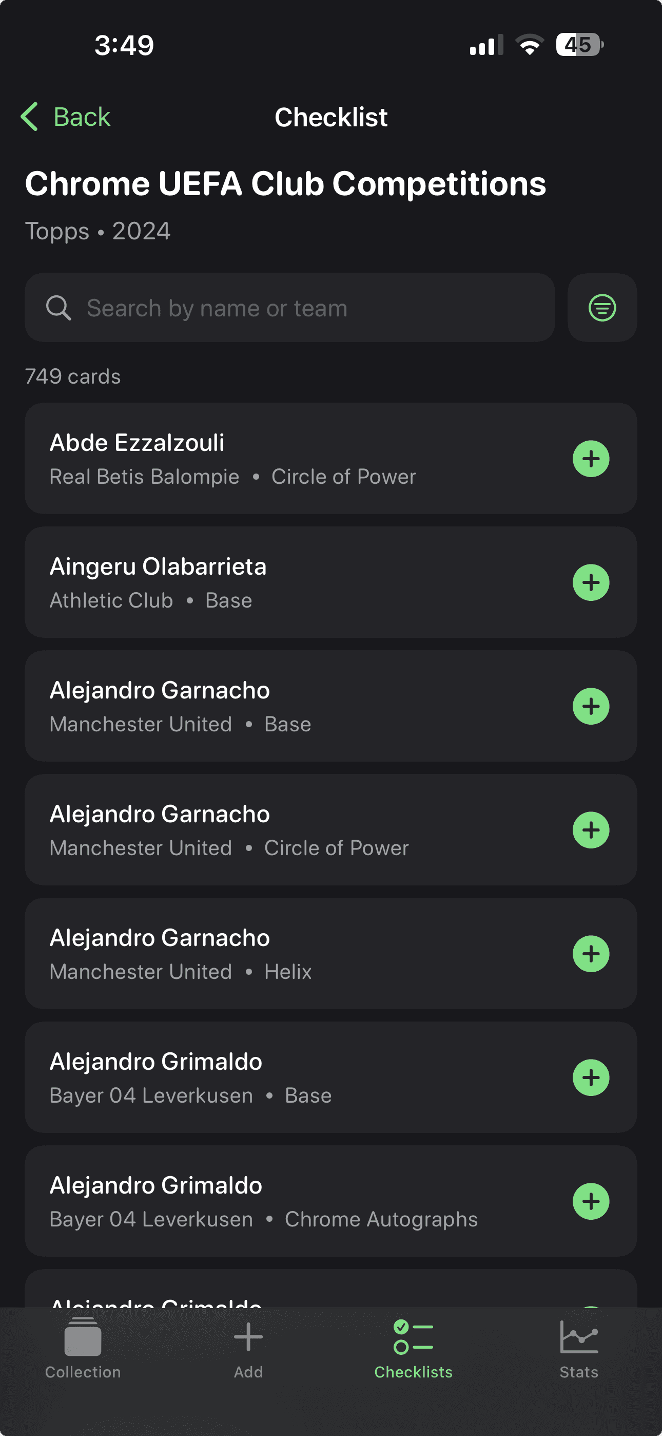
In-app content was updated alongside real-world card releases. As new sets dropped, checklists and databases were refreshed so collectors could use Binder as their source of truth. That timeliness made it feel like a living tool that grew with the hobby, not just somewhere to store cards.
Outcome
Good design doesn't stop at usability. When built with intention, it drives distribution, retention, and revenue.
Binder's 2.4% churn rate sits well below the 5–9% category average. That retention came from genuine value, habit, and trust, not artificial engagement loops.
Looking back, there are two things I'd do differently. I'd invest in data visibility and analytics earlier. Deeper behavioural understanding would have helped prioritise features faster and identify drop-off points before they became problems. And I'd back myself sooner; initially I moved slowly out of caution, but the positive feedback that came in early was a signal I should have leaned into harder.
Key learnings
- Design is distribution. When something looks and feels great, people want to show it off, and that's how new users find you.
- Friction is expensive. The fewer steps between curiosity and reward, the faster trust builds.
- Generosity scales. Giving away more value than expected built credibility, which made monetisation easier later.
- Consistency compounds. Growth came from consistency: updates, content, and showing up for the community over time.