Lifting conversion on samsung.com/au with two small A/B tests
At Cheil, Samsung's in-house digital agency, I joined the conversion rate optimisation team focused on samsung.com/au. Working in fortnightly sprints, I researched behavioural insights, designed modifications, and ran A/B tests to validate whether our hypotheses moved the needle. This case study covers two tests from a programme of 35.
18%
conversion rate increase across product filter pages
12%
increase in interactions on offer cards
12.4%
increase in cart adds for discounted products
12
tests personally approved by stakeholders
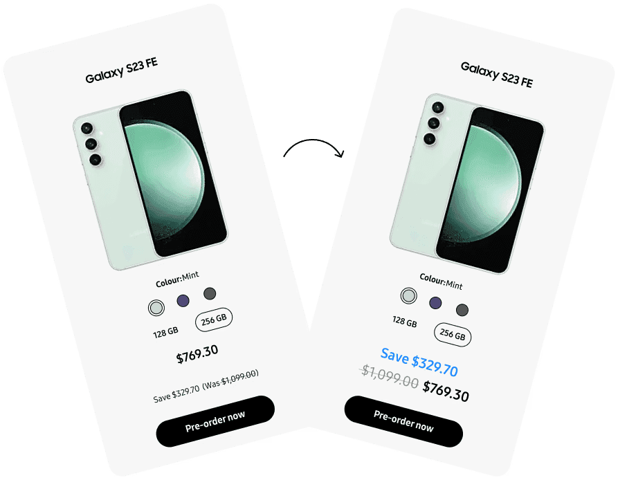
Before and after of a key change from Test 02. The offer card on the right pulls the saving above the price and sets it in Samsung blue, making the discount impossible to miss.
Context
A junior designer embedded in a CRO team running 12 insights per fortnight: research, design, ship, repeat.
Cheil is a digital agency owned by Samsung Group. As a junior UX designer on the CRO team, my role spanned the full cycle: pull behavioural data, identify friction points through heuristic review and competitor analysis, design modifications, hand off to developers, and interpret A/B test results.
The team of three UX designers targeted roughly 12 insights per fortnight. These were workshopped, refined and presented to Samsung stakeholders for approval before being queued for testing on the live site via Adobe Target. Over my time there, I personally designed 12 tests that were approved, two of which are covered in this study.
- ~35 A/B tests designed and shipped across the programme
- 12 of my own tests approved by stakeholders
- All tests required 95% statistical confidence before declaring a result
- Tests ran for varying durations based on traffic volume and active campaigns
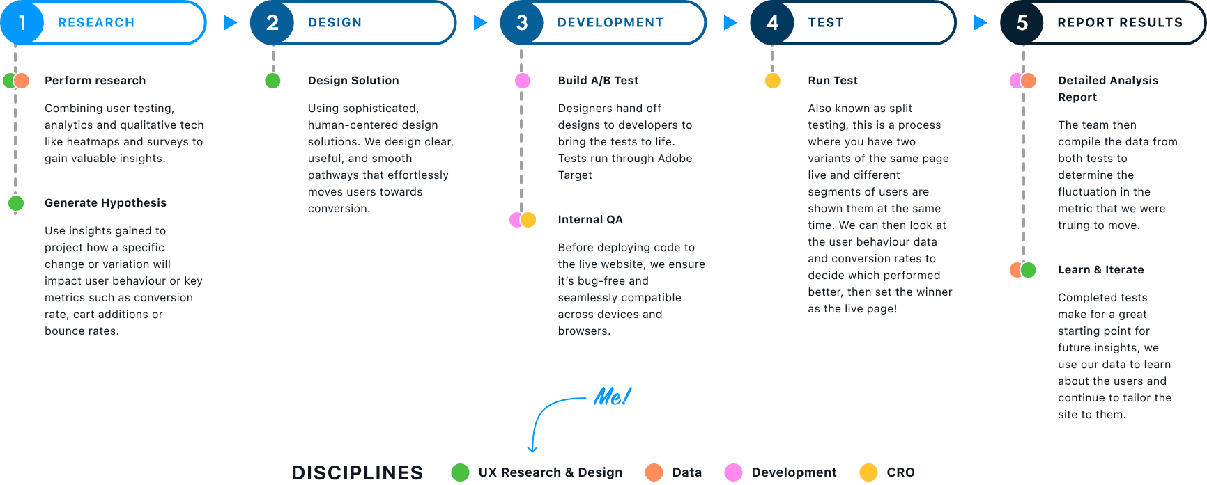
The fortnightly cycle. My part was research and design; development, testing and reporting ran through the rest of the team, and every result fed the next round of insights.
Users
Samsung.com sells everything from phones to washing machines, and those buyers behave completely differently.
One of the most important early realisations was that a single insight rarely applied across the whole site. The user arriving to buy a Galaxy phone is not the same person buying a refrigerator. Treating them the same would produce noisy tests and unreliable results.
Mobile shoppers
Swayed by aesthetics, brand reputation, and cutting-edge specs. Decision cycles are short: social influence and peer recommendations are strong drivers. They browse quickly and can be impulsive.
Home appliance shoppers
Prioritise function, durability, and energy efficiency. Extensively research before deciding, comparing specs, reading reviews, and checking compatibility. The decision-making process is deliberate and rarely impulsive.
TV and monitor shoppers
Driven by visual quality, screen size, and use-case specifics like gaming or professional editing. Similar research depth to appliance buyers, but heavily weighted toward technical specs and user experience reviews.
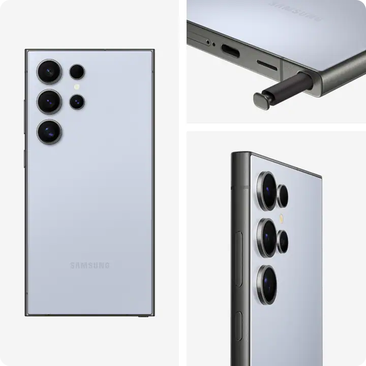
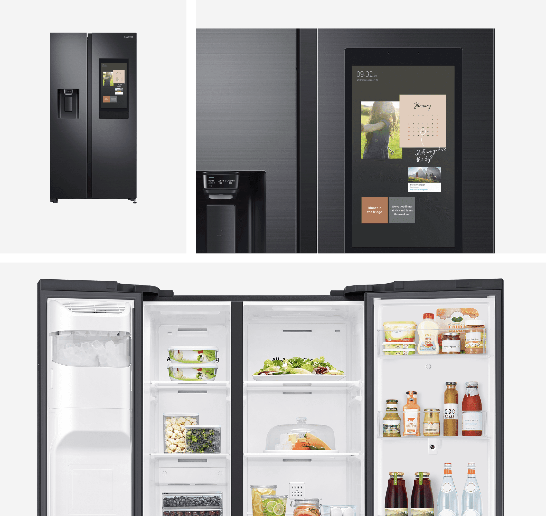
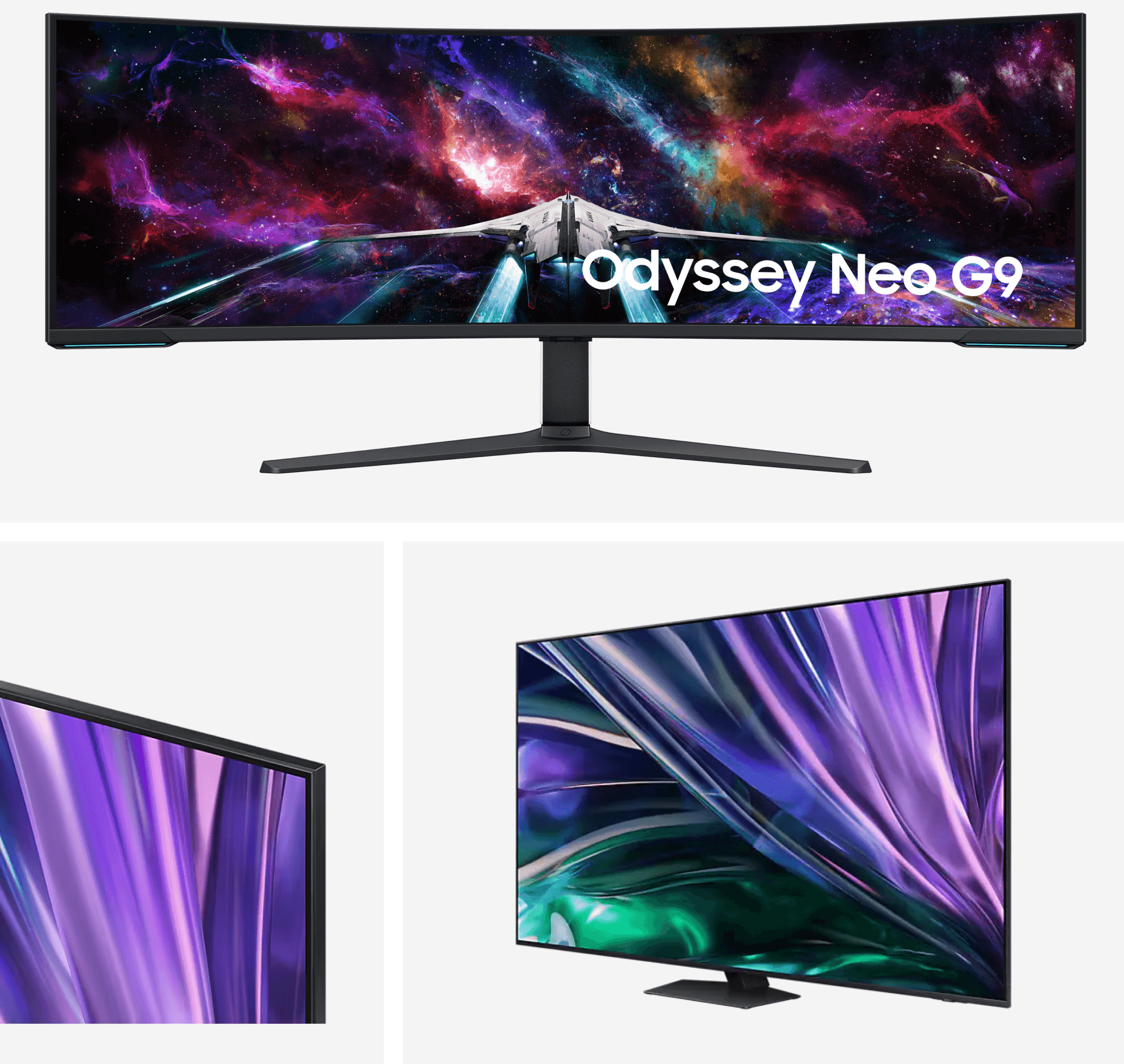
Phones, appliances, screens: three product categories, three different ways of deciding.
Mapping these distinctions meant we could design more targeted hypotheses. Rather than testing a single change site-wide, we could isolate specific page types where behaviour aligned with our theory.
Test 01
Users were paralysed by choice, and social proof gave them a reason to stop scrolling and commit.
This test was rooted in Hick's Law: the more options presented, the longer it takes to make a decision. Samsung's product filter pages were overwhelming. Session replays revealed two behaviours that crystallised our hypothesis: the first two product cards received the most clicks by a significant margin, and the majority of users scrolled to the bottom of the page within five seconds, far too fast to meaningfully compare options.
Hypothesis: If we highlight user reviews on highly-rated products and introduce a "Top Rated" section above the fold, users will find it easier to decide because social proof reduces the cognitive burden of choosing.
Samsung had a rich review database, the result of post-purchase incentives for leaving feedback, but was making almost no use of it on-site. We identified this as a clear opportunity. Even when product filters were sorted in various ways, analytics showed the top-positioned cards consistently received the most cart adds and converted highest. Pairing this with scroll depth data, we hypothesised that surfacing pre-approved, highly-rated products earlier in the journey would reduce friction between browsing and purchasing.
The test introduced star ratings directly onto product cards and added a "Top Rated" callout section above the fold across four page types. The control converted at approximately 1.3%; we targeted at least a 3% uplift at 95% confidence. The test ran for four weeks due to high page traffic.
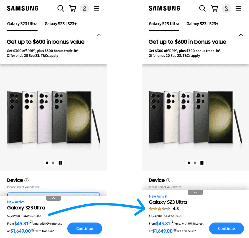
Adding star ratings to product cards. The control (left) offered no social proof, while the variant (right) surfaces a 4.8-star rating drawn from Samsung's review database.
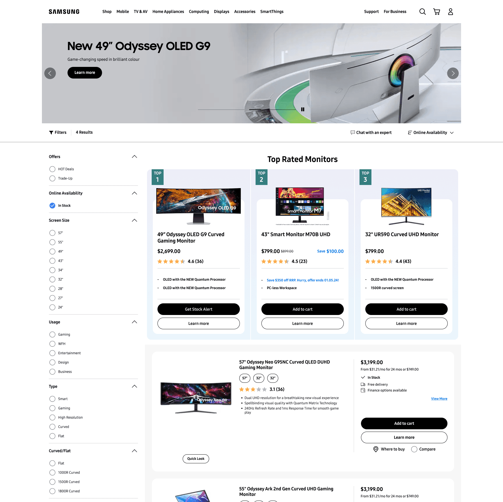
The variant also pinned a “Top Rated” section above the fold, bringing highly-rated products into view before users scrolled past.
Result
A collective 18% increase in conversion rate across all four page types, significantly exceeding our target. The key learning: give customers the content they're already looking for as early as possible, and use social signals to validate that content. This test shaped the direction of subsequent work across the programme.
Test 02
Users were scrolling past offers without seeing them, and making the discount visible changed everything.
Samsung's product catalogue spans hundreds of items. On filter pages, users moved quickly and missed critical information, particularly sale pricing. Click data told a revealing story: users were interacting with offer cards and non-offer cards at almost exactly the same rate. They couldn't tell the difference.
Samsung's competitive position made this especially important. Unlike most brands, samsung.com competed directly with third-party retailers like JB Hi-Fi and The Good Guys, all selling the same products. Exclusive online offers were a genuine USP, but only if users could actually see them.
Hypothesis: If we make discount information on product cards more visually prominent, click-through rates on offer cards will increase because users will recognise the value immediately rather than scrolling past it.
Competitor research confirmed that differentiating offer cards from standard cards was best practice, and most of Samsung's major competitors were already doing it. We made three specific changes to offer product cards:
- Moved the savings amount above the price so it was the first financial figure seen
- Applied Samsung's primary brand colour to the savings figure to create immediate visual contrast
- Increased the original price text size and added a more defined strikethrough
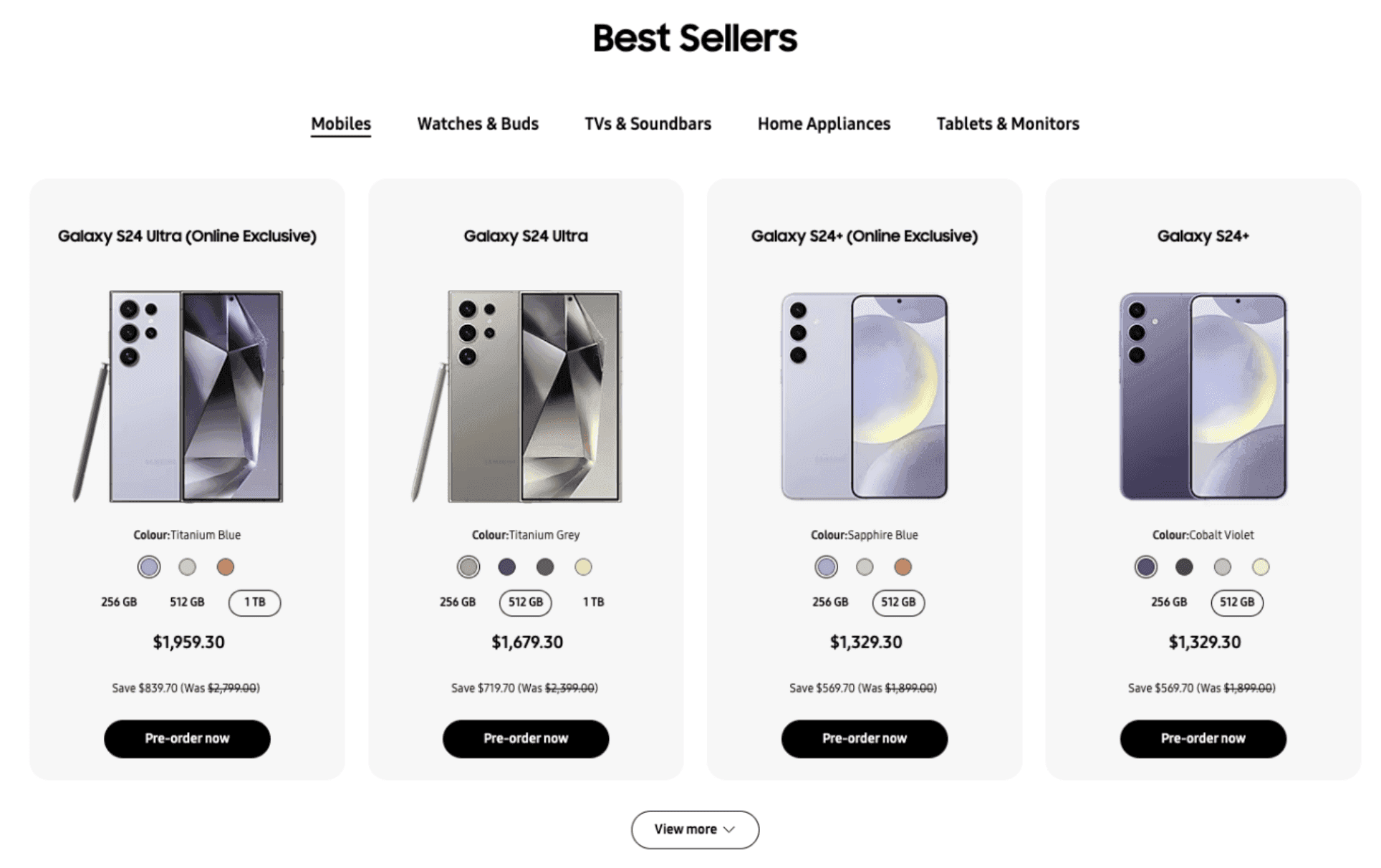
Control: offer cards were near-identical to non-offer cards, with the saving tucked in small grey text beneath the price, so shoppers scrolled straight past it.
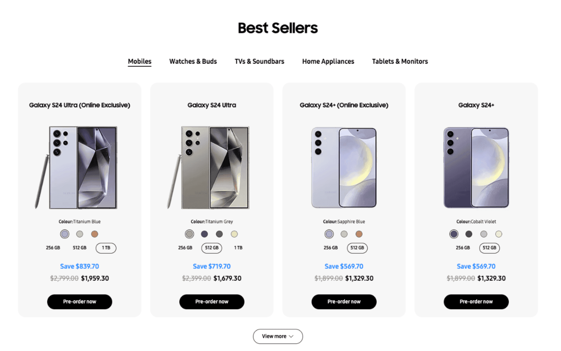
Variant: the saving jumps above the price in Samsung blue, with an enlarged original price and bolder strikethrough to make the value read instantly.
Result
A 12% increase in interactions on offer cards versus non-offer cards, and a 12.4% increase in cart adds for those products. The test reinforced a core principle: information hierarchy is not decorative. When users can immediately identify relevant value, behaviour changes. This test contributed to a measurable uplift in revenue for Samsung Australia.
Outcome
Failure only occurs when you learn nothing. Every test, win or loss, sharpened the next hypothesis.
Across the programme, the team shipped approximately 35 A/B tests. I personally designed 12 tests that were approved and queued, several already live and others in the backlog. The strongest results from my work:
- 18% conversion rate increase on product filter pages via social proof
- 12% increase in offer card interactions by creating contrast between price and savings
- 5.5% decrease in bounce rate on the mobile discover page by redesigning above-the-fold content
My time at Cheil taught me that rigorous process, rooted in data, validated through testing, and held to a confidence standard, is what separates guesswork from design. An unsuccessful test isn't a failure; it's signal. The goal is always a deeper understanding of the user.